Description of project: The team and I made four different graphs according to the data set that has to do with Anxiety and Depression.
Description of data set: The data set my team and I got for the project is dealing with anxiety and depression. It has data sets from employment, ages, physical activity hours, sleep hours,etc.
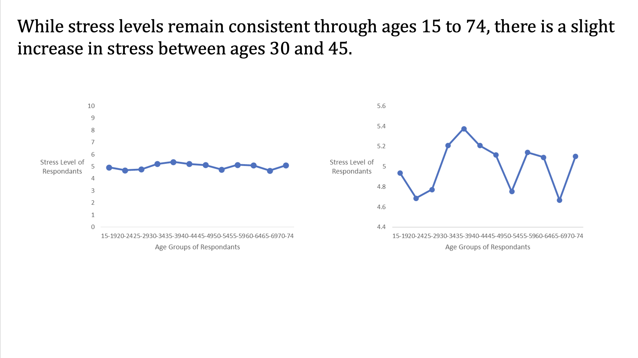
Do stress level increase as people get older? No, stress levels do not consistently increase as people get older. For this Time Series chart we used the ages of individuals to track the levels of stress as people get older. From a scale of one to ten, there doesn’t seem to be any difference but once you lower the scale there is a bigger increase of stress from ages thirty to forty-five. We decided to make two time series graphs to highlight this discovery.
The way the we created the scatter plot is by using only the stress levels and age of individuals. We had to make sure to minimize the stress levels of respondents so we could see more of a significance in the time series plot. We also removed the bar line and added the titles for both the x-axis and y-axis. The accuracy for both are the same however, the second time series plot is visually see the change.
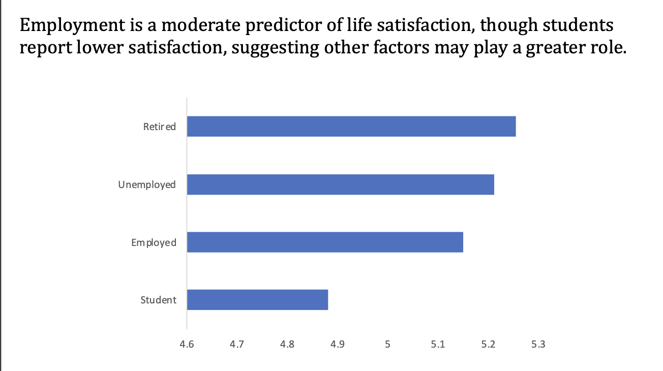
Is employment a good predictor of life satisfaction for people? For this bar chart, we used different employment statuses to compare average levels of life satisfaction. The results show that retired, unemployed, and employed individuals report similar satisfaction, while students show noticeably lower scores. We chose a horizontal bar chart to clearly display these differences across groups. This helped us see that employment is only a moderate predictor of life satisfaction, with other factors likely playing a bigger role.
The way we created this chart is by using both the employment status and life satisfaction data. Therefore, by doing this we could make the bar chart to answer the question. We had the employment in our Y-axis and the life satisfaction on the X-axis. When picking the exact chart to use we had to pick the bar chart in which was horizontal not vertical.
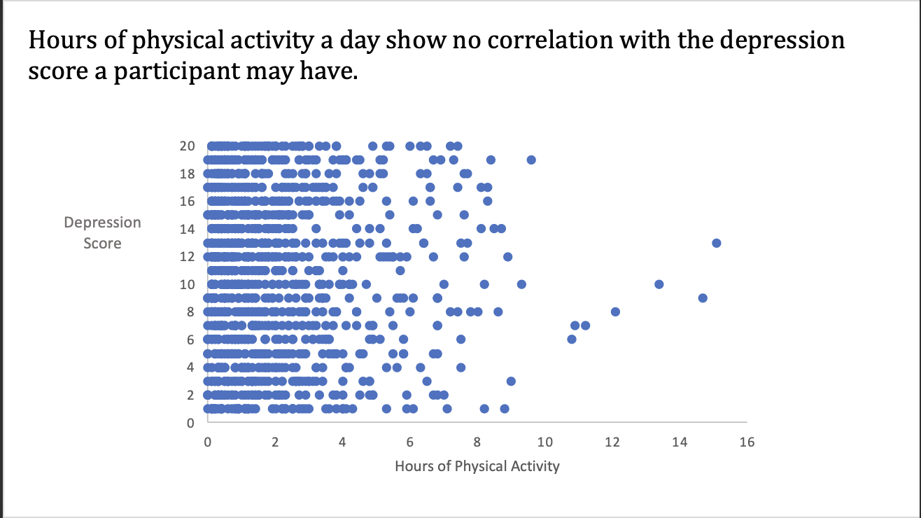
Is there a relationship between physcial hours and depression score? For this scatter plot, we used participants’ daily hours of physical activity and compared them with their depression scores. The points appear widely spread with no clear pattern, showing that increased activity does not consistently relate to lower or higher depression scores. We chose a scatter plot to easily visualize any potential correlation between the two variables. This helped us conclude that there is no strong relationship between physical activity and depression scores in this dataset.
The way we created the scatter plot is by using the physical hours and depression score data. We made our scatter plot by choosing the scatter plot graph and making our Y-axis the depression score and x-axis the physical hours.
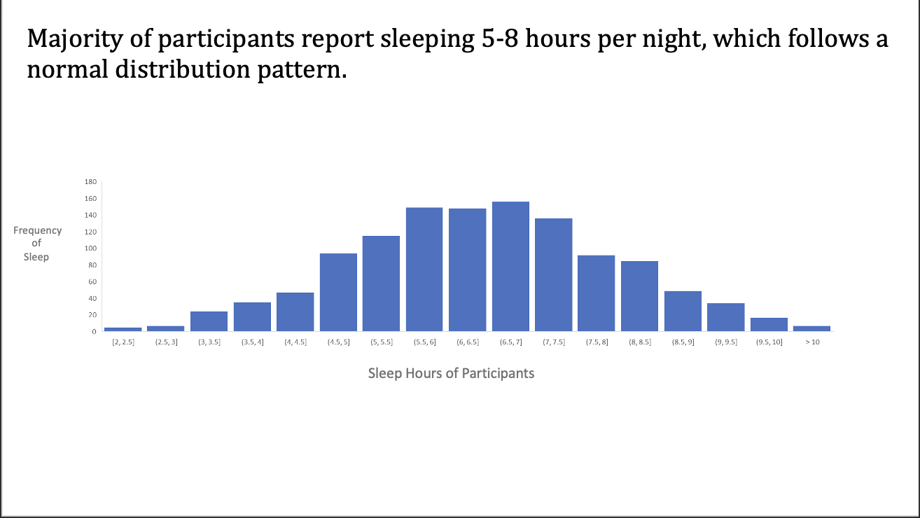
What is the statistical distribution of sleep hours per day? For this histogram, we used the number of hours participants sleep per night to explore the distribution of sleep patterns. The chart shows that most people sleep between 5 and 8 hours, with frequencies peaking in that range. We used a histogram to highlight the shape of the data, which resembles a normal distribution. This helped us conclude that sleep hours are fairly symmetric and centered around the average adult recommendation.
When we created the histogram chart was by using the frequency of sleep and the sleep hours of the participants. We then picked the Y-axis being the frequency of sleep and X-axis being the sleep hours of participants. We had to minimize our data so the histogram would have a more acuarte visualization to interpt.